Channel partners are often juggling multiple brands, making it crucial that your eLearning is clear, engaging and easy to absorb. Our ability to make sense of visuals in the blink of an eye vastly helps our capacity for learning complex concepts.
In this blog, we explore graphic design for eLearning to help you transform your channel partner training into visually striking, effective and user-friendly learning experiences.
Why Graphic Design Matters in Channel Partner eLearning
People are hardwired to process visual information at incredible speeds. In fact, MIT neuroscientists discovered that the human brain can identify images seen for as little as 13 milliseconds.
Visual learning speeds up information retention, ensuring partners quickly grasp complex concepts such as product differentiators, problem-solving and sales strategies.
To leave things as “visuals matter in eLearning” would be a gross oversimplification. It’s not enough that your eLearning courses have great pictures.
High-quality graphic design can set your training apart, reinforcing your brand while improving the overall partner experience.
Applying the principles of graphic design results in the following:
Stimulates learners
Coherent graphic design stimulates the imagination of learners. Through the help of visuals, the capacity to absorb, comprehend and analyse new information can be pushed beyond initial limits.
Minimise cognitive overload
Trying to learn anything when it is only presented and explained through text in a short amount of time is challenging.
Our brains need to take the extra steps to process the language, highlight the most important parts, and attempt to unpack ideas inside our heads. Visuals are shortcuts our minds can take to the ultimate goal of understanding.
Help build mental models
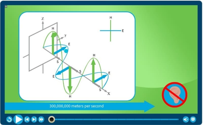
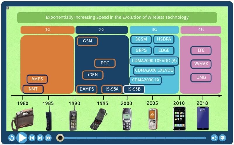
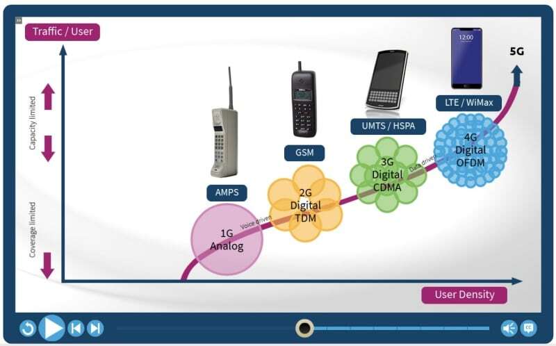
Graphic design can assist learners in visualising layered systems. Charts make it easier to grasp large organisational structures. Graphs connect items to show proportions and trends. Line diagrams illustrate steps and processes.
Avoid overabundance of visuals
Following graphic design principles also means having restraint when using visuals. You should not be just bombarding your learners with picture after picture on every page of every training module.
You need to ask yourself and your course designers such questions as:
- Are these visuals relevant to the lesson?
- Are these visuals only tangentially related?
- Are these visuals practically the same as the others without adding anything new?
- Are there too many visuals on the screen?
Graphic Design Techniques for More Effective Channel Partner eLearning
With an appreciation for how graphic design can improve your channel partner training program, it’s time to get into the techniques you can apply to achieve such a goal.
Here are five fundamental aspects to focus your efforts on:
1. Create a Clean and Intuitive Layout

Channel partners have limited time so your training needs to be structured in a way that allows them to grasp the key takeaways quickly.
Some of the best practices for an engaging layout include:
- Make use of white or negative space. It is the absence of any element—text or visual—that dictates where the learner’s attention should be directed.
- Isolate a point to underscore its importance.
- Use bulleted lists to highlight key principles.
- Group and arrange similar elements together.
- Prioritise key information at the beginning and the end of lessons and modules for better retention.
2. Use Typography to Enhance Readability

The font you use plays a significant role in how well learners take to your eLearning course.
Reading can play a significant role in eLearning.
Consider the font style, size and colour, as these aspects all factor into readability and engagement with learners.
Keep the following in mind:
- Font style sets the tone for text. Stick to clean and crisp fonts to convey a professional tone.
- Even if the course you design leans toward a fun and creative approach, with eLearning you can’t go wrong with a sans-serif font such as Arial or Verdana.
- You can use multiple font styles for contrast, but keep it to just two styles.
- For font size, 14 and 16 are the standard point sizes for body text.
The ultimate objective for your font choice is ensuring legibility. Forego flashy fonts that distract and make reading any harder.
3. Leverage the Right Colors to Reinforce Branding & Learning

If used properly, colour will enhance your eLearning courses. Depending on the combination of chosen colours, you can make a course aesthetically exciting or a complete eyesore.
Fortunately, you don’t need an art degree to get a feel for what colour palette looks good for your course. There are plenty of free online resources that provide complementary colour schemes for you to emulate, such as Colour Combinations Tester, Coolors, and Color Hunt.
A few pointers when picking your palette include:
- Align training visuals with your brand’s identity while also using color psychology to enhance learning.
- Use colour coding to categorise different product lines, certification levels, or key messages within the training.
- Follow the 60-30-10 rule. The neutral colour should be used 60%, the complementary colour 30% and the remaining 10% should be for the accent colour.
- Contrast is critical, especially for fonts. Fonts should never blend in with the background so they become hard to read. Keep accessibility in mind.
4. Make the Most of Graphics & Visual Aids

There are plenty of ways to implement visual media like illustrations, photographs, and animations to spice up your eLearning course.
Here are techniques you can use without having extensive graphic design experience:
- Add flair to basic charts and graphs — Use product comparison visuals to help partners quickly differentiate your offerings.
Prioritise interactivity – Introduce interactive elements like clickable diagrams or annotated images to boost engagement.
5. Streamline Navigation for a Seamless Learning Experience

Channel partners need a smooth training experience to stay engaged so it’s important to ensure your chosen eLearning platform has intuitive navigation.
- The core tenets of improving navigation are simplicity and consistency. Keep labels short with phrases like “Next Page” or “Exit Course”. Place buttons and links in the same areas so learners don’t have to spend time looking for them on every page in your course.
- Graphic elements like lines, arrows and icons can communicate directions succinctly and lead the eye through a page. Take advantage of visual shorthand symbols to streamline navigation and maintain a clutter-free look.
- Include a progress bar that learners can easily view. A visual representation of how much time is left in a course can help manage expectations, act as a checklist for topics covered and pace self-learning sessions better.
Integrate Graphic Design into eLearning
By incorporating thoughtful graphic design principles, you can create training that’s not only visually engaging but also more effective in driving partner success. If you’d like to explore how to enhance your eLearning courses, we’re here to help. Get in touch to learn more.
