Turn Your Partner Training Program into a Predictable Revenue Engine
We’ll help you increase partner-sourced pipeline, accelerate deal velocity, and scale partner performance through commercially focused partner training programs.

Proven ROI within 90 days that justifies your investment
Our clients see measurable business impact within 90 days as partners become more effective through well-structured partner training programs.
85% of high-training partners sustain year-over-year growth
20% annual growth for top-tier partners
11% greater profitability from empowered training
3x ROI on channel investment
Wahoo Learning helped us transform partner capability into a genuine revenue driver. We've been able to reach a broader audience and service partners who otherwise wouldn’t have been able to take advantage of training. Win, win.
Charlie Morrison Fell
Global System Engineering , CommScope
I am very pleased with Wahoo Learning's support. Nicola did an excellent job keeping the project on track and we could not have accomplished all of our goals without her project management skills. Everything was delivered as expected and the feedback from our customers has been excellent!
Mike Cooper
Senior Manager - Global Sales, CommScope
The Wahoo Learning Instructional Design team are always on hand to update existing courses or create new eLearning for product launches. They work professionally, often to tight deadlines, and the courses always put the learner front and centre.
Charlie Morrison Fell
Global System Engineering , CommScope
To guarantee the needs of our partners are met, Wahoo Learning’s customer service specialists provide high-level multichannel support to all our users, ensuring there is always a solution to any issues.
Charlie Morrison Fell
Global System Engineering , CommScope
The CommScope Infrastructure Academy is continuously updated and developed to adapt to our ever-changing needs. The team understands CommScope and our customers and always works towards strengthening our reputation with our partners.
Charlie Morrison Fell
Global System Engineering , CommScope
"We've been able to reach a broader audience and service partners who otherwise wouldn’t have been able to take advantage of training. For our partners, training is much more accessible and is delivered online to save the cost and time associated with attending training courses. Win, win"
Charlie Morrison Fell
Global System Engineering , CommScope
I am very pleased with Wahoo Learning's support. Nicola did an excellent job keeping the project on track and we could not have accomplished all of our goals without her project management skills. Everything was delivered as expected and the feedback from our customers has been excellent!
Mike Cooper
Senior Manager - Global Sales, CommScope
The channel partner problem
Your Partners Can Only Drive Revenue If They Are Trained
The result of poor partner enablement? A partner ecosystem that underperforms. Not because partners don’t want to succeed, but because they haven’t been set up to win through structured partner training programs.
Partner Performance Stalls
Partners lack product knowledge and sales skills. They ramp slowly and rely heavily on internal teams
Internal Resources Are Limited
Your team is overstretched, lacking the time, skills, or budget to manage training.
Limited Partner Visibility
Leadership lacks clear visibility into which partners are revenue-ready
Support Overload
Untrained partners flood your support team with basic questions. Channel managers are stretched trying to “fix” underperforming partners
Declining Partner Retention
Partners without proper onboarding and ongoing support become frustrated and churn.
Lack of Training Impact
Training completion doesn’t translate into better deals

Partner training programs built for commercial impact
Enable partners to sell more effectively by ramping partners faster, improving selling confidence, and driving consistent performance across the channel - without adding operational burden to channel or enablement teams.
OUR SOLUTIONS
Commercially aligned partner training programs
We design partner training programs around real buyer conversations, sales motions, and revenue goals.
From LMS management and support to content updates and partner engagement, we remove the operational burden from your teams.
- Complete program administration, support, and finance management
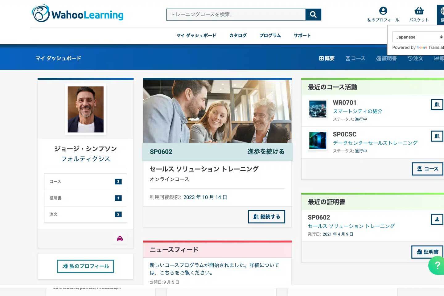
- Fully customisable, translatable WahooLMS platform designed for partner audiences
- Track what matters: partner readiness, adoption, and impact on pipeline and sales performance.
- Dedicated communication channels and ongoing optimisation support

OUR SOLUTIONS
Bespoke training content and enablement
High-quality, engaging content creation that transforms partner capability and accelerates outcomes. Custom animations, videos, 3D modelling, and gamification keep learners engaged and coming back.
- We’ll help you create, refresh, or reimagine your learning content
- Our designers create innovative and effective learning materials tailored to your audience
- Proven experience in creating quality course material across complex industries

Trusted by global tech brands to transform partner performance
A trusted catalyst for channel growth with 20+ years of proven results in transforming underperforming partner networks into revenue-driving assets.
750% AVERAGE PARTNER GROWTH
150k ACTIVE LEARNERS
200+ COUNTRIES REACHED


