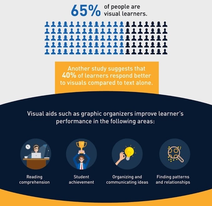
With 65% of us being visual learners, creating online training material and content that lacks visual stimuli like pictures, video, audio, graphs and infographics will greatly reduce the efficacy and retention rates of your training courses.
In fact, one study going all the way back to 1969 found that users only retained 10% to 20% of information delivered through spoken or written methods after 3 days. Visual information proved to be superior with users retaining 65% of it after three days.
Another study found that the brain’s visual cortex is more powerful than previously thought, as it can help people make decisions.
In this guide, let’s dive into how you can create visual content optimised to make learning and long-term knowledge retention possible.
Visual Content for Online Courses
Infographics

(Source: Business Backer)
Infographics are visual representations of data, statistics, processes, comparison analyses, and other information that would otherwise be presented in long-form content. The intent is to present information quickly and clearly in an easier-to-digest format.
When creating infographics, you should:
Simplify the design — An overly complex design will only make information harder to understand. The idea is to present even the most advanced data in a simpler graphic.
Minimise the text — Too much text can make the image look cluttered. The visuals should be enough to communicate information.
Keep the focus — If you’re sharing how-to information, stick to it. Adding more data will divert learners’ focus away from the actual point of the infographic.
Limit the colours — A visually-appealing image is harmonious. That means limiting your palette to colours that complement each other, instead of picking any colour that you think will pop.
Mind the flow — A good infographic presents itself as a good story would. The layout should flow from top to bottom through the proper use of visual cues.
Videos
The demand for video is skyrocketing due to how much more engaging and interesting it is compared to other content. The familiar format similar to those on social sites also makes it more comfortable for learners to consume them.
Videos can be used as instructionals (e.g. how-to’s, tutorials), customer testimonials, and walkthroughs of solving real-life issues. When creating videos, you need to:
Outline the flow of your video — An outline will direct the flow and pace of your videos so that one section connects with the next. Have a clear start and end to keep it simple. Don’t overload one video with too much information, as you can create a separate video to break down advanced information.
Mind your tone — Your narration can make a video engaging or dull. In your script, choose simpler words and state facts. Add some personality and talk naturally, as learners will more likely remember the information that way. Always practice narration before recording.
Present videos right — Presentation involves how the video looks and the audio quality. Use the right microphone and screencasting software, as faulty tools will only affect video quality. Pick the right location to record to reduce distractions with background sounds.
Do post-production editing — After recording the videos, add elements that will make it more enjoyable to watch like transitions, closed captions, effects, and animations.
Related reading: 5 tips for creating videos for eLearning courses
Charts and graphs

(Source: Datapine)
Charts and graphs are excellent ways to present trends, complex relationships, patterns, and associations between variables. This can be in the form of flow charts (showing a series of steps or processes), pie charts (showing percentages of a whole), and vertical bar graphs or line charts (showing changes over time).
When creating these, keep in mind to:
Choose the right chart type — Pick one that will best tell the story of your data (i.e. line graphs for progression, flow charts for processes).
Design properly — Make sure there’s enough white space between bars and series to make data easier for learners to understand. Remove unnecessary background lines, shadows, 3D effects, and redundant labels to avoid distractions that only make the data harder to read.
Animations
Animations can help learners pick up information through more accessible, interactive, and simplified content.
Animation types suited for e-learning include whiteboard animations, character or cartoon-style animations, stick figures, stop motion, motion graphics, or a combination of live action and animations.
To create this type of content, you should:
Pick the right element for the right emotion — A lighthearted animation will not convey serious topics well. Be mindful of this as every aspect of this content (e.g. music, sound effects, script) can affect the tone of the course.
Make it interactive — Instead of learners passively watching an animated character, ask questions and let them click on objects or options to make the course more interactive.
Add audio — Add music and narration to explain what the animated character is doing and minimise confusion.
Characters and avatars

(Source: CommLab India)
Characters and avatars add sociable elements to modules, making them more fun and memorable. These characters can act as guides throughout the course, ask questions, explain topics, highlight important facts, tell a story, or be used in case studies.
To create avatars:
Find the right personality — Research your learners’ demographics so you’ll know which personality and image they will relate to.
Speak naturally — Make your character speak the way a colleague would in the office: casual, informal, and conversational.
Use more than one character — Different roles can be played by different avatars, especially if the course tackles a variety of concepts or ideas.
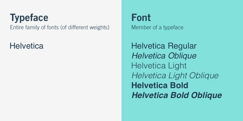
Typography
 (Source: Career Foundry)
Typography involves typefaces, fonts, and colours that you’ll use to bring life to your written content. When choosing typography for your courses, you should:
Use familiar fonts — Unfamiliar ones can make courses harder to read and impede learning.
Pick fonts that will stand out — Whichever typeface you choose, make sure it’s legible and will stand out among all the visual elements in your modules.
Choose the right colours — Colours will add to the visual appeal of your modules, but make sure that it will not hurt the visibility and readability of any text on the screen.
Play with contrast — Contrast between texts (e.g. headlines vs body text), coupled with white spaces, will make the course more readable.
Comics
 (Source: Google)
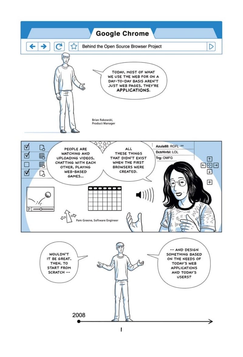
Comic strips have an instant appeal as they can give people a sense of childhood nostalgia. The familiar panel will stand out on a page and give learners a fun way to understand new products or concepts. A study, in fact, found that this can improve comprehension of instructions.
For effective comic strips, you need to:
Determine if there’s a story — Some instructions may not translate well into comics. Study your material first and see if it can be turned into a story. If a story is possible, start outlining and sketching what goes into each panel.
Choose layouts — If you’ve read graphic novels or comic books, layouts vary widely. Stick to 5 to 10 common layouts, depending on how long the entire comic strip will be.
Immersive content
Businesses are quickly adopting new technologies for employee training, including AR and VR for online courses. With resources like these, learners can simulate and practice high-risk tasks without real-life consequences.
To create AR/VR online courses:
Determine if this is the best approach — While its use is on the rise, the immersive tech works best with hypothetical situations, especially if the task is high-risk or delicate. If it won’t fit your material, don’t force it.
Create the story — Understand first your learners’ needs. Based on your findings, create scenarios that will address their pain points and what skills they need to hone.
Make the solutions effective — If the solutions inside the immersive tech are not realistic and correct, learners will reject the scenario presented.
Develop the AR/VR solution — There are plenty of AR/VR companies that can do this for you. Be realistic with your timeframe (it can take a minimum of 6 months to develop) and make sure that you can add modifications and additions to the course for when the need arises.
Related reading: Everything you need to know about our eLearning production service
Adding Visual Appeal to Your Courses
As eLearning solutions rise in popularity, you need to spruce up your content by capitalising on the power of visual elements to make your modules more visually arresting. This way, your learners will retain new knowledge long-term and your courses will achieve their goals.
Creating courses will be a lot easier if you have an eLearning service provider with all the tools you need to create visual content like animations, immersive learning, and 3D interactions. Book a demo with us today to see how our solutions can help you.


